Choosing a Colour Palette for Your Business
When it comes to marketing, first impressions are everything - and choosing the right details to represent your business can go a long way in creating a cohesive visual identity that builds trust and recognition with your ideal target audience.
Colour is one of the fundamental ways in which we understand the world around us, from knowing when to stop at a traffic light to choosing what brands we want to shop with. Understanding the basics of developing a colour palette that works for your business, is key to creating a high-quality visual personality for your brand.
Whether you’re starting a new business or looking to refresh your company’s existing identity, keep reading for six ways to start developing a cohesive colour palette that will help you connect and resonate with the audience of your dreams.

Monochromatic
A monochromatic colour palette contains different tints and shades of the same base colour. A tint is formed by adding white to your base colour while shades are made by adding black.
A monochromatic colour palette creates really strong visual cohesion and can be a great choice when you want your audience to associate one core colour with your brand.
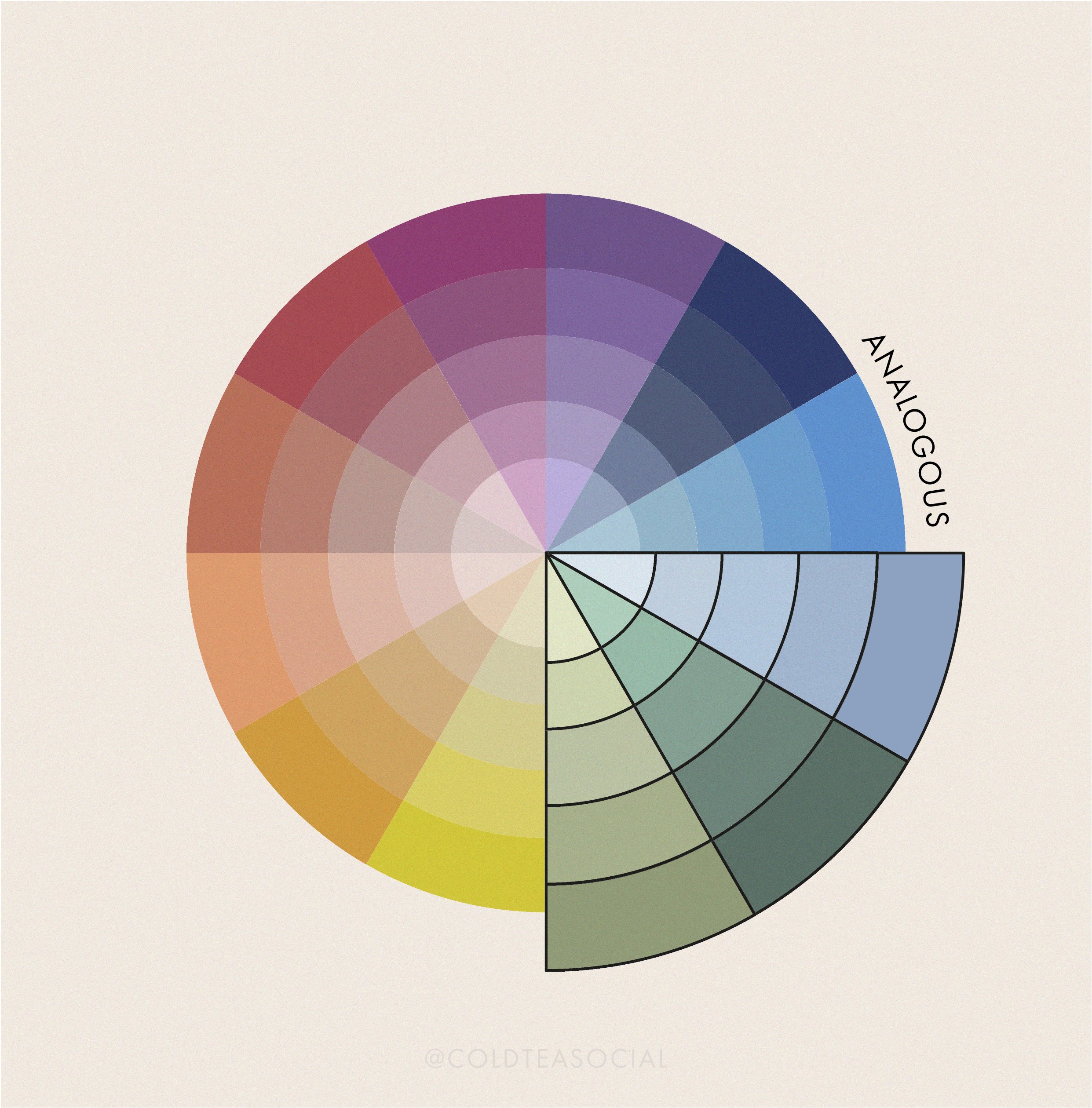
Analogous
An analogous colour scheme is developed by selecting colours that are adjacent to one another on the colour wheel.
Analogous colour palettes have a harmonious effect and can do wonders to create a calming, natural feeling visual identity.
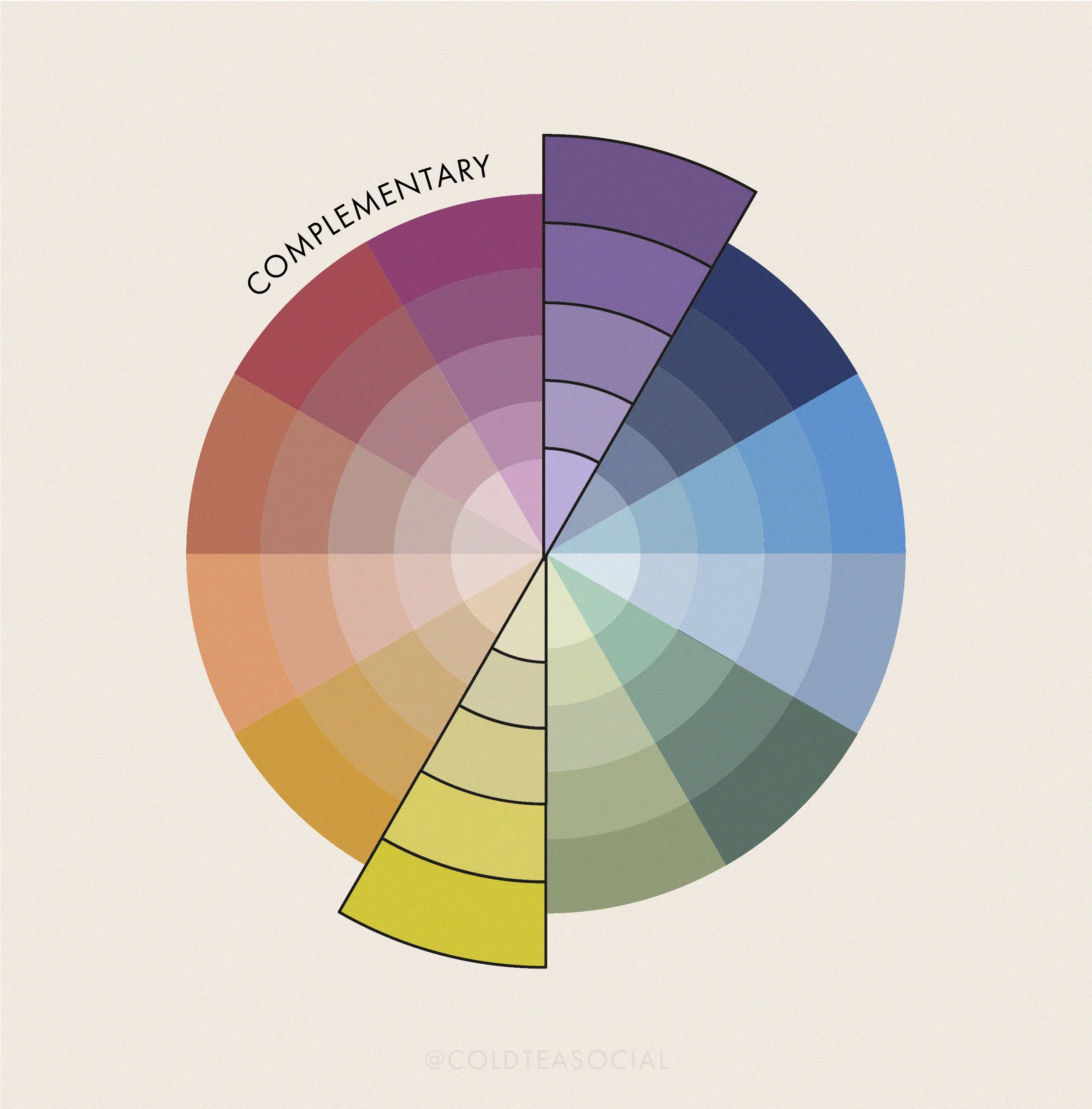
Complementary
Complementary colours are ones that are opposite to one another on the colour wheel. These combinations are full of contrast and play off of one another in a way that creates a sense of balance when viewed together.
Think of complementary colour schemes as natures way of saying, "opposites attract”.

Triadic
Triadic colour schemes are created by selecting three colours on the colour wheel that are equally distanced from one another.
Triadic colour schemes are vibrant, cheerful and provide sharp visual contrast. By choosing one colour to be most dominant you can elicit different emotional responses from consumers, using the other two colours to highlight details.

Split-Complementary
Split-complementary colour schemes offer a slightly softened approach to the stark visual contrast of a traditional two-colour complementary colour palette.
A split-complementary colour scheme is vibrant and versatile. The colours closer together create a sense of harmony while the opposing colour adds contrast and offers a great way to highlight different elements in your marketing materials.

Tetradic
Tetradic schemes take advantage of dual complementary colours to create a palette comprised of two opposing pairs that form a rectangle on the colour wheel.
This colour palette offers a lot of variety and often work best if one of the colours is selected as a base to be used more prominently in your visual identity. The other three colours can then be used as accents to highlight and add depth to different aspects of your creative materials.